UI DESIGN | DESIGN SYSTEM
Redesigning the Hyatt Residence Club member website to simplify complex interactions and optimize usability.
PROJECT STATEMENT
The Hyatt Residence Club is a timeshare program in the U.S. They discovered users were struggling through the booking process and were looking for a complete overhaul of their website. The solution had to scale easily and be optimized for their target demographics.
** Branding and content creation were done concurrently to the website redesign, therefore, most sections are using FPO copy and images. **
Case 1: The Clash is a self-initated zine that uses the album "Combat Rock" by The Clash and relates it to psychological disorders. Each spread represents a track of the album in listening order and was given a specific psychological disorder that most closely matched the content, mood or lyrics of the song. For example, Track 3 is "Should I Stay or Should I Go" and was paired bipolar disorder. A cut-up, punk style collage was used to to give homage to the era and personality of The Clash. The visuals and overall page layout represent each disorder and the relation between it and the song. Words from the song as well as the song title, disorder name and defintion are incorporated in each spread.
Case 1: The Clash is a self-initated zine that uses the album "Combat Rock" by The Clash and relates it to psychological disorders. Each spread represents a track of the album in listening order and was given a specific psychological disorder that most closely matched the content, mood or lyrics of the song. For example, Track 3 is "Should I Stay or Should I Go" and was paired bipolar disorder. A cut-up, punk style collage was used to to give homage to the era and personality of The Clash. The visuals and overall page layout represent each disorder and the relation between it and the song. Words from the song as well as the song title, disorder name and defintion are incorporated in each spread.
Case 1: The Clash is a self-initated zine that uses the album "Combat Rock" by The Clash and relates it to psychological disorders. Each spread represents a track of the album in listening order and was given a specific psychological disorder that most closely matched the content, mood or lyrics of the song. For example, Track 3 is "Should I Stay or Should I Go" and was paired bipolar disorder. A cut-up, punk style collage was used to to give homage to the era and personality of The Clash. The visuals and overall page layout represent each disorder and the relation between it and the song. Words from the song as well as the song title, disorder name and defintion are incorporated in each spread.
ROLE
Book Design, Concept, Creative Direction
CLIENT
Self
ACCOUNT PAGES
CATERING TO THEIR AUDIENCE
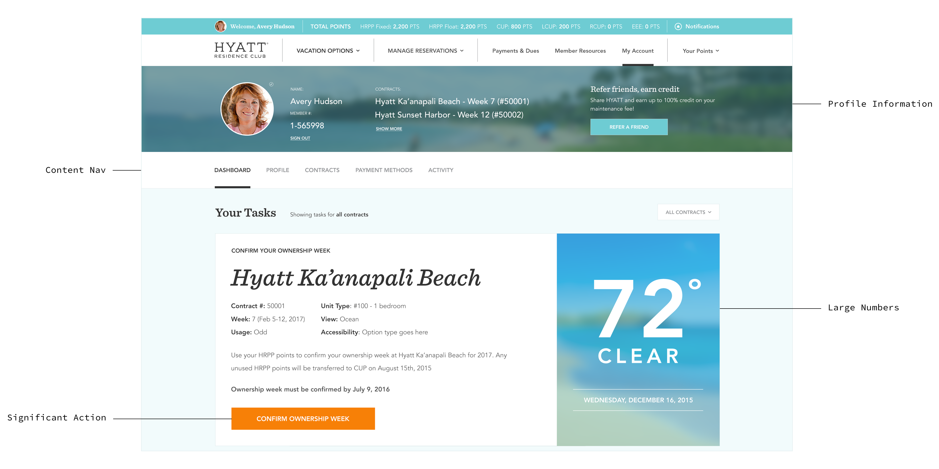
Targeting adults aged 30-60 with families, I optimized the account page for ease of use. User profiles and direct navigation are prominently placed at the top, remaining visible as you scroll. Bright-colored buttons and large numbers enhance visibility for key actions and dates.
FLOW DEVELOPMENT
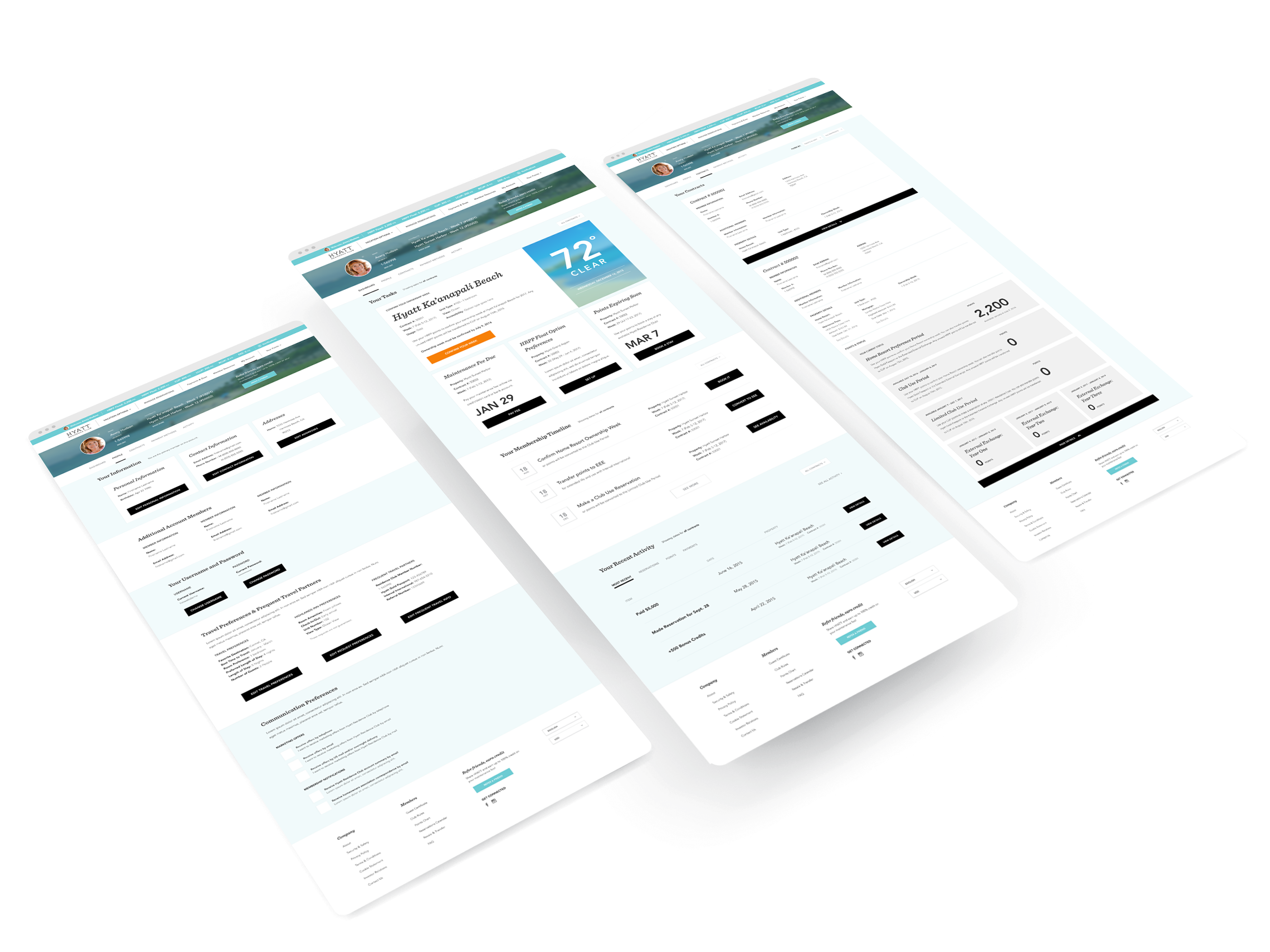
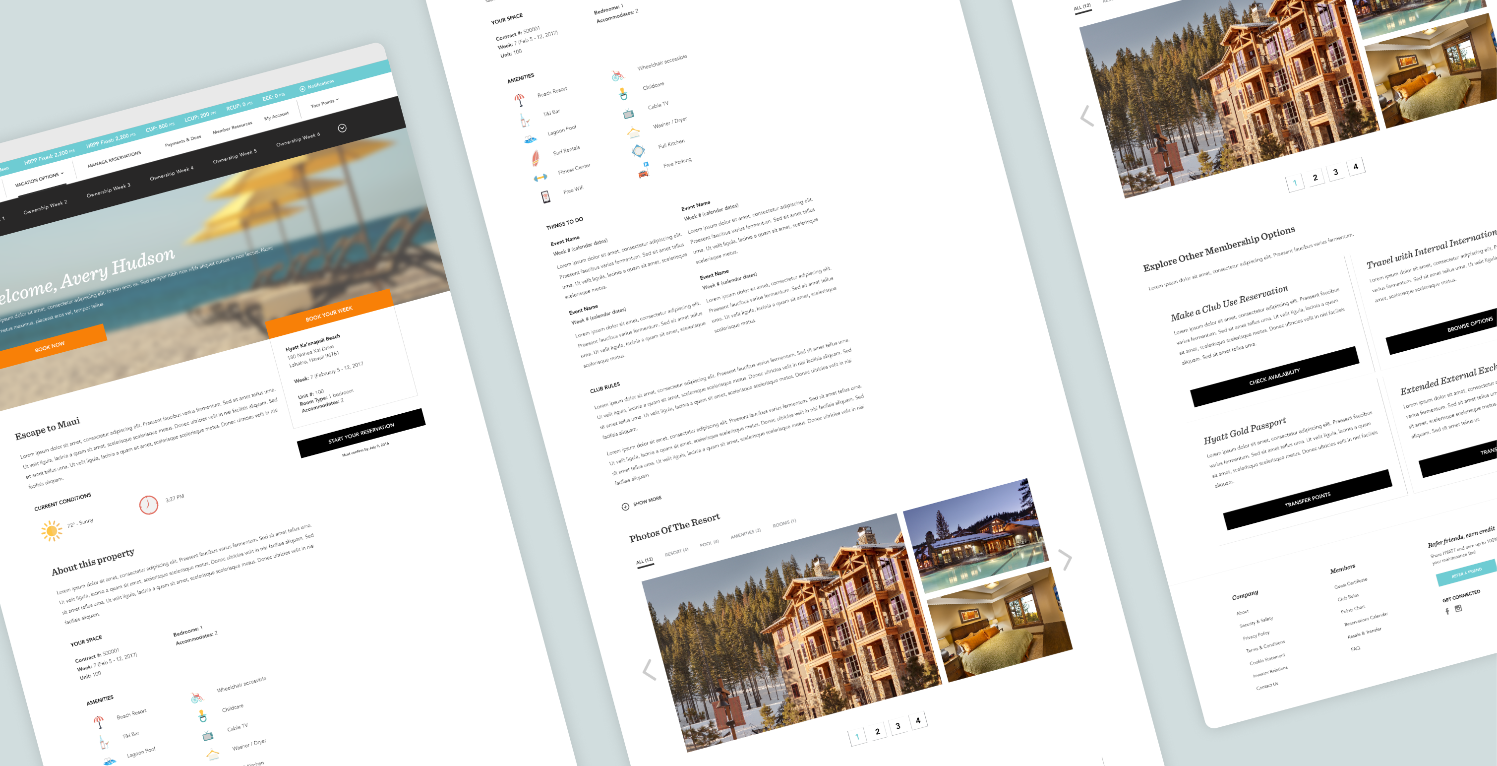
Our main challenge was to simplify the booking process. Our UX team collaborated with Hyatt to redesign the sitemap strategically. As the UI designer, I refined basic wireframes into a scalable system that streamlined these flows.
By reusing components and modules throughout the site, we enhanced cohesion and simplified the steps. Bright calls-to-actions and limiting tasks per page improved step-by-step clarity. Information entered remained visible throughout the booking process, allowing editing to remain accessible and increasing flow awareness.
Each page was made by printing and cutting millions of images and laying them out by hand. They were manipulated in this process and while scanning each page by sections onto a computer. Once scanned they were pieced back together and reprinted to give it this punk look.
ADDING PERSONALITY
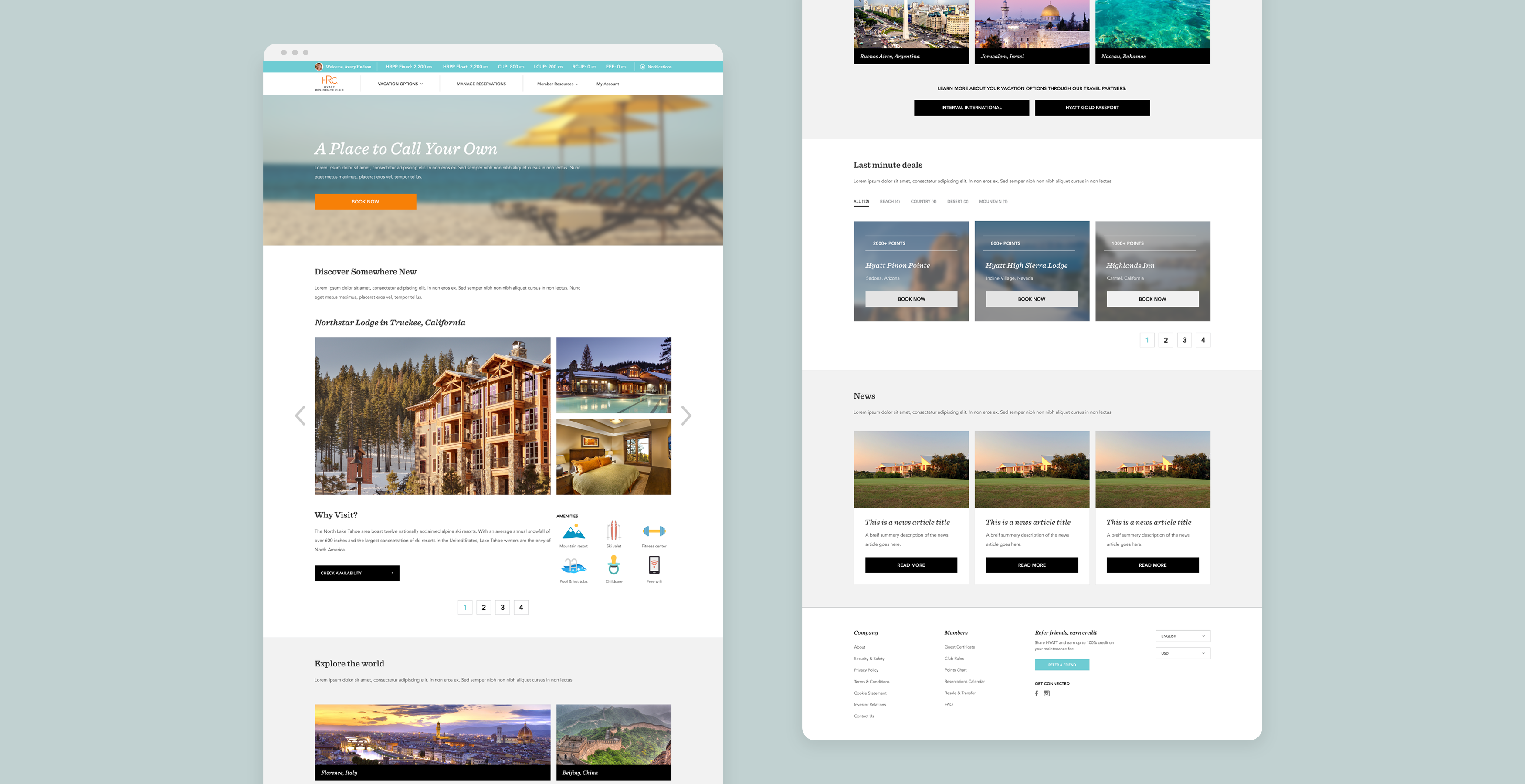
High-quality imagery showcasing Hyatt properties in diverse locations was paired with expanded brand colors and newly developed icons to enhance brand cohesion and align with their updated guidelines. These elements provided contrast and infused Hyatt's personality into text-heavy pages.
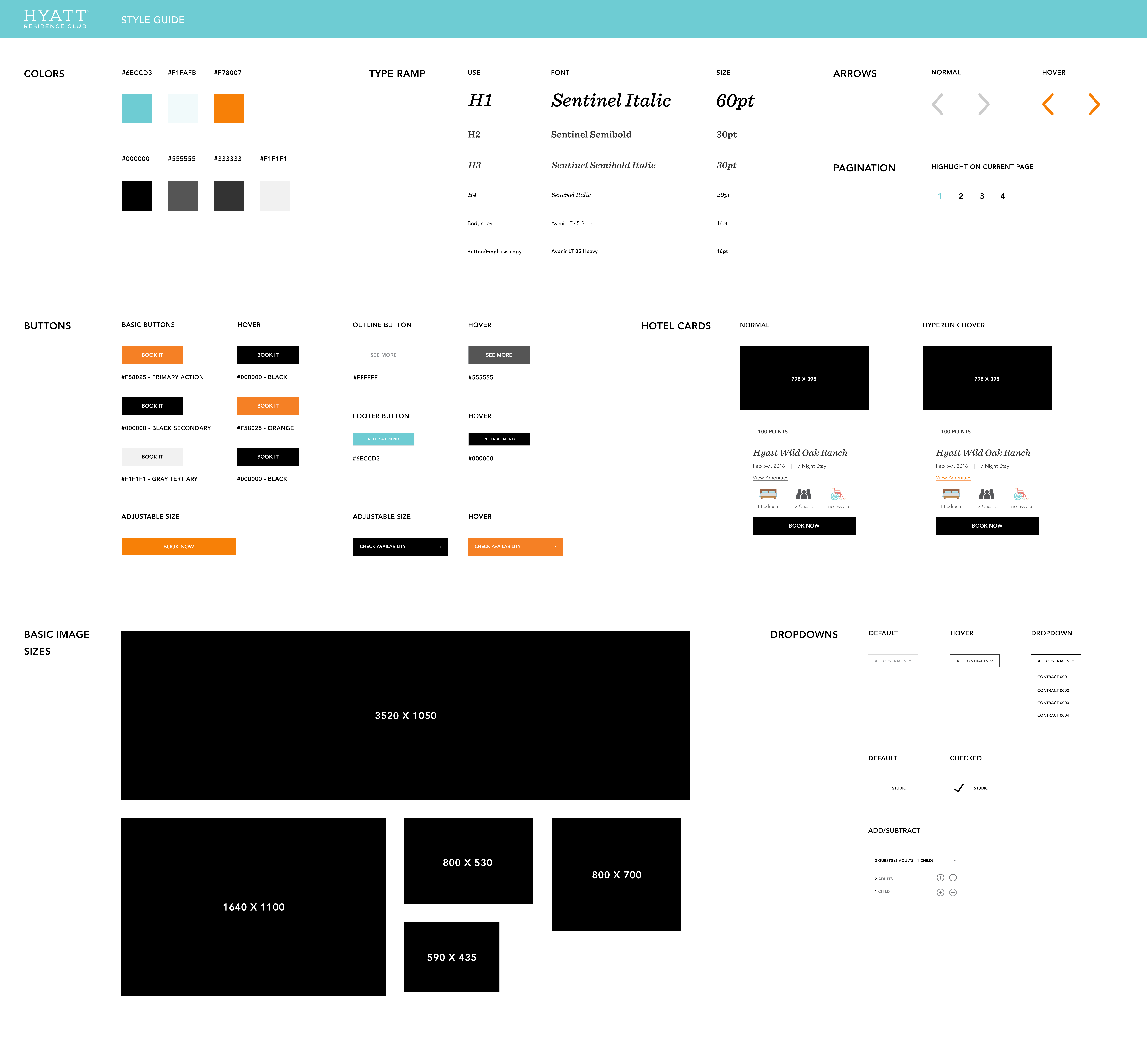
CREATING A STYLE GUIDE
I developed a comprehensive style guide to ensure website consistency and a smooth handoff to developers. While we weren't able to implement an extensive design system, I created reusable components and modules to enhance uniformity across their dense sitemap. It also reduced implementation time by enabling developers to make quick style decisions and create micro animations based on the hover elements defined in the style guide.
CHALLENGES AND LEARNING
Our team encountered challenges in the beginning stages which caused us to restructure our approach and internal workflow to address the delays in client deliverables. By breaking down the site into manageable segments, we tackled issues at a granular level and expanded solutions across other sections as we received input from the Hyatt team. Despite working in parallel, this iterative process and our established style guide allowed us to remain flexible and incorporate new assets on the fly, helping the site to come together in a cohesive way.
IMPACT
Hyatt was impressed with our rollout and quick turn around with their new assets. We heard the time it took to successfully book a location decreased as well as the number of abandoned bookings. The Hyatt team was grateful for this overhaul and paired with us on multiple other projects including websites and app updates.